How a well chosen palette can influence offers, perceived value, and buyer interest in Phoenix West Valley, AZ homes. This introduction explains why color matters for sales in local markets and previews room-level recommendations. Guidance covers neutral strategies, accent use, lighting considerations, and how to coordinate finishes with common Phoenix West Valley home styles. Practical tips and local examples show how to pick shades that appeal to active buyer preferences while highlighting features that sell.
Living Room Color Choices That Welcome Offers
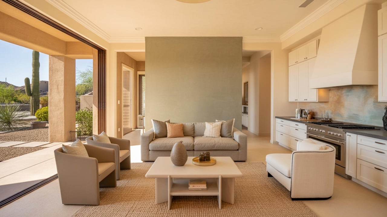
Living rooms set the overall tone for property viewings in Phoenix West Valley, AZ. Select a neutral base that reads warm under midday sun and soft under evening fixtures. A warm greige or soft warm white frames architectural details without competing with furnishings. Consider a single feature wall in a muted coastal blue or soft sage to add character in open-plan layouts. Test samples on multiple walls and view them at different times to confirm how afternoon light from west-facing windows shifts the tone. If crown molding or built-in shelving is present, paint those elements a clean bright white to create contrast that enhances perceived ceiling height. Offer guidance to the staging crew to keep large furniture neutral and allow the wall color to be the unifying element.
Kitchen Palettes That Enhance Perceived Value
Kitchens benefit from colors that complement cabinetry, countertops, and hardware. A light warm taupe on walls makes white cabinets appear crisp and highlights stainless steel finishes. For dark cabinetry, a soft warm gray increases contrast while keeping an inviting feel. Backsplash tones should harmonize rather than match exactly; a subtle hint of warm blue-gray in tile can tie together cool metal and warm wood. Flush-mount fixtures and undercabinet lighting will show how paint reflects on surfaces, so sample patches near these zones before committing. If open shelving exists, paint the wall behind shelves a slightly deeper shade than the walls to create depth and draw attention to styled displays.
Primary Bedroom Hues That Encourage Offers
Primary bedrooms should evoke calm and restfulness while appealing to a broad range of buyers. Pale mauve or cool stone shades create a tranquil backdrop that pairs well with warm wood tones. For rooms with large windows facing west, choose cooler neutrals to offset afternoon heat and glare. Keep trim and closet doors consistent with the main wall color or a tone lighter to maintain cohesion. When working with coffered ceilings or accent beams, paint those elements a subdued off-white to emphasize architectural detail. Soft textured finishes on an accent wall can add interest without overwhelming the space.
Secondary Bedrooms And Guest Rooms Color Strategies
Secondary bedrooms require flexible palettes that suit multiple uses. Soft warm beige or a gentle dove gray makes the space adaptable as a bedroom, office, or hobby room. If a room will be marketed as a child-ready option, use wall color sparingly and rely on textiles for playful accents. For small rooms, a light reflective shade keeps the space feeling larger. Closet interiors painted a light neutral help items stand out and make storage appear more organized during showings. Coordinate switchplate and outlet colors with the wall tone to keep visual clutter low.
Bathroom Colors That Convey Cleanliness And Quality
Bathrooms sell best when they feel clean and light. A crisp warm white on ceilings and a slightly warmer neutral on walls creates a fresh contrast that complements tile and fixtures. In powder rooms, a muted jewel tone on a single wall can add sophistication when paired with a bright white trim. For bathrooms with little natural light, choose a light neutral with warm undertones to avoid a sterile look. Paint durability matters in wet areas; use a satin or semi-gloss finish that resists moisture and cleans easily. Match paint undertones to countertop veining to create a seamless visual effect.
Home Office And Flex Room Colors That Support Function
Home-office color choices should help communicate purpose while remaining appealing to a broad audience. A subdued green-gray or soft blue encourages focus without being distracting. In open-plan homes, ensure office paint harmonizes with adjacent living areas to keep flow intact. For rooms intended as multiuse spaces, paint three walls the main neutral and a fourth wall a complementary shade to define the workspace. Position samples near electrical outlets and cable drops to verify how paint reflects on screens and glossy surfaces. Lighting layers, including task lights and ceiling fixtures, will influence how the chosen color performs during virtual showings.
Entryway And Hallway Colors That Make Strong First Impressions
Entryways and hallways are critical for first impressions in Phoenix West Valley, AZ residences. A unified neutral across these transitional spaces creates a sense of continuity from the front door into main living areas. Consider a slightly deeper tone in the entryway to ground the space and a lighter shade in long hallways to open sightlines. For homes with tile or stone floors, select wall tones that pick up warm or cool undertones in the floors. If architectural niches or staircases are present, highlight them with a restrained contrast that guides the eye without overpowering the space. Good placement of accent lighting will show how the color works during evening showings.
Exterior Color Schemes That Boost Curb Appeal
Exterior paint choices must complement roof materials, stonework, and desert landscaping common in Phoenix West Valley neighborhoods. A warm sand or soft taupe for body paint pairs well with clay or concrete tile roofs and makes trim details stand out when painted a clean off-white. For ranch or southwestern style exteriors, a gentle terracotta accent on shutters or doors can add charm while keeping the primary palette broad in appeal. Test exterior samples on siding and view them at sunrise and sunset to see how the low sun alters perceived warmth. Use high-quality exterior paint with a durable finish to maintain a fresh look through intense sun exposure.
Garage And Utility Space Finishes That Add Practical Value
Garage and utility areas contribute to buyer perceptions of functional condition. A light neutral on walls and ceiling increases brightness and makes the space feel cleaner and more usable. Painting the floor with a neutral-toned epoxy enhances durability and creates a more finished impression during inspections and open houses. For utility closets, a slightly darker neutral can conceal shelving and storage while keeping the space readable. Coordinate door and trim colors with the interior to keep the overall presentation unified when the garage is shown with door open.
Staging Tips For Phoenix West Valley, AZ That Complement Paint Choices
Staging should support chosen paint schemes to emphasize livability and highlight desirable features. Select furnishings and textiles that either blend with the neutral foundation or introduce restrained accent tones that appear throughout the home. In sunlit rooms, use lighter fabrics that reflect light and enhance perceived spaciousness. For model homes or staged properties, include locally appropriate accents such as clay pottery or woven textures that resonate with Phoenix West Valley architectural styles. Work with a local real estate agent to time staging with peak showing hours and to ensure that color and furniture choices align with current buyer preferences in the area.Can you tell me the client's target location (city or region) so I can include it in the outro? Once I have that, I'll write the 3–5 sentence closing with the required link to Suzanne Ross at suzannerosshomes.com.